

10 Fonts You Should Never Use
(And 10 You Should)
Fonts aren’t all unlike fashion. The styles change. Fonts become popular than unpopular. And as soon as everyone starts using a certain font, it goes out of style.
So the fonts on this list aren’t necessarily bad fonts. But because of their overuse or misuse, you should probably stop using them.
But we don’t want to mean and offer no hope. So we’ve also put together a list of ten fonts you should start using. (So those can go out of fashion and we can make a whole new list!)
Enjoy the list!

It’s a great font, it’s just been overused on the web. You don’t need to use this for print.

This become overused and unpopular in the 90’s. Let it go, please.

Another great font. Unfortunately, churches have used and abused this font to death.

Everyone hates Comic Sans. Don’t give people an excuse to hate you too.

Pedro used this font to get elected in Napoleon Dynamite. That doesn’t mean it’s a good font.

No typewriter has ever made text that looks like this. Don’t use it.

Another font overused in the 90’s.

This font just can’t make up its mind. Is it a system font or a cursive font?

Avatar may have used this font for all their titles. But so has every church and stationary company. Let Papyrus go.

Unless you’re Microsoft’s site in the 90’s, you have no business using this font.
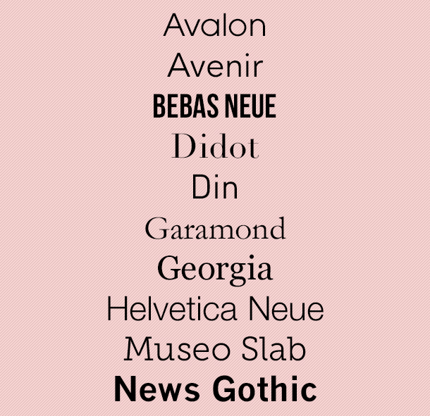
So what fonts should you use? I’m so glad you asked. Here are ten good ones. (Though, let’s use them sparingly. We don’t want them to crash and burn too early.)
That’s our list! What fonts do you think should be added to the “Do Use” and “Don’t Use” list? Share in a comment below.


