7 More Ways to Ruin Your Design
A couple weeks ago we posted seven ways for you to ruin your design. That wasn’t an exhaustive list by any means. Us Christians are masterful at ruining good design.
So we put together seven more ways to ruin your graphic design. This list isn’t meant to offend or criticize, rather to educate and entertain. Enjoy the list and chime in with your own ways we ruin designs with a comment below.
1. Typos
Even the best design looks chumpish if you misspell words. Put a ton of eyes on your graphic designs. The message if primary.
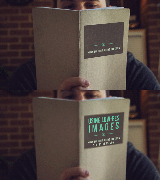
2. Using low-res images
Just because you can resize an image in Photoshop, it doesn’t mean you should. Buy a larger version of the photo or take a higher-res version.
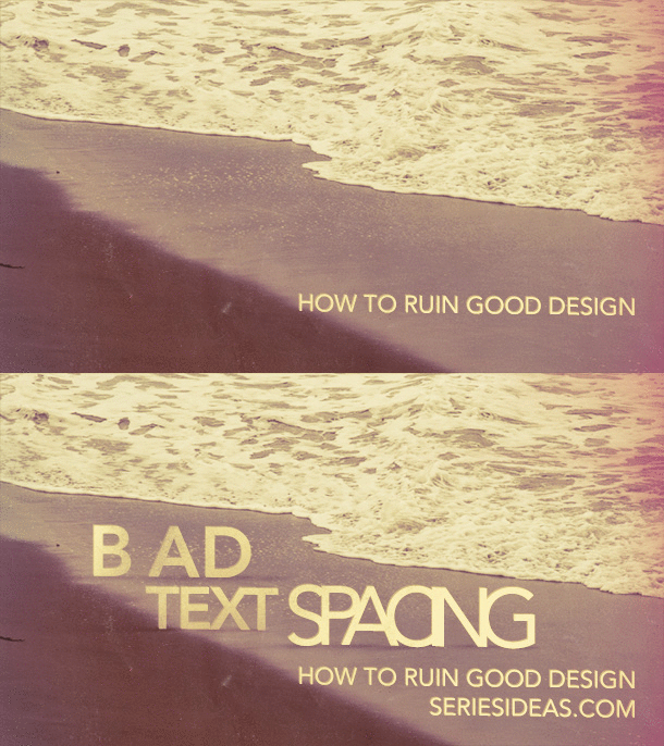
3. Bad Text Spacing
Beware of kerning, line-spacing, and character spacing. “God is now here” doesn’t carry the same meaning when your kerning jacks it up to read “God is nowhere”.
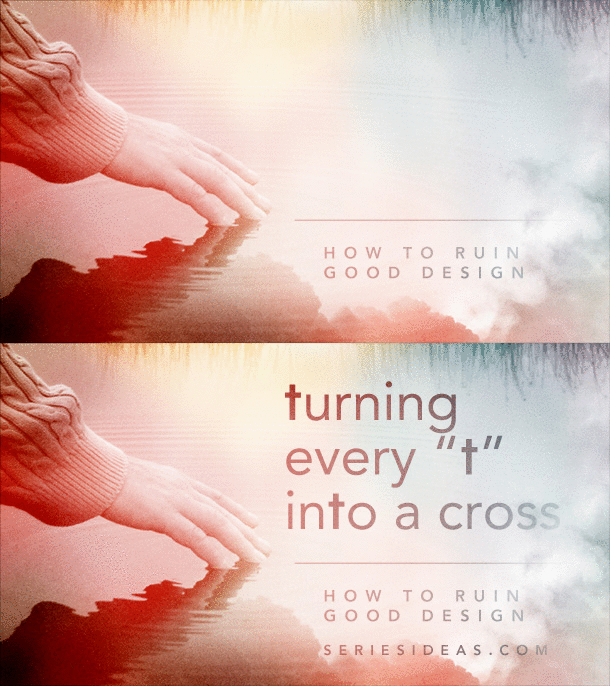
4. Turning every “t” into a cross
Resist the temptation. It might seem divinely inspired that your church name has a “t” in it. Just remember though, so does the word “butt”.
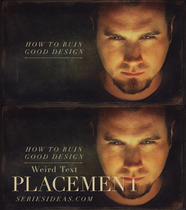
5. Weird text placement
Covering the word “where” in the wrong place can make it look an awful lot like “whore”. And you don’t want the guy in your pic to look like he’s sucking on a “t” lollipop.
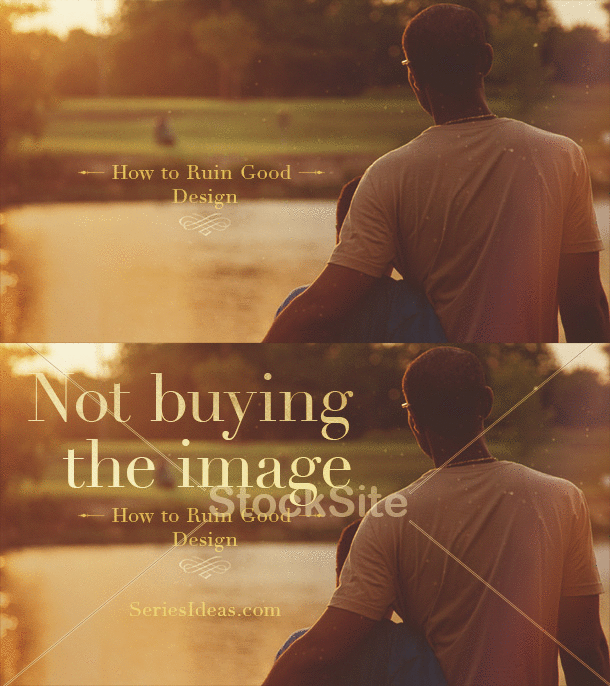
6. Not buying the image
-_-
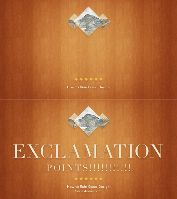
7. Exclamation points
Contrary to popular belief, exclamation points don’t make things more exciting. “Weak point, yell loud” isn’t the best way to communicate.
Those are some of the most common and egregious mistakes I’ve seen in church graphic design.
How have you seen people ruin their graphics? Chime in with a comment below.


