

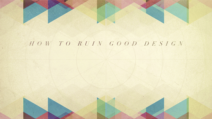
7 Ways to Ruin Your Design
So you have a great idea for your sermon series. Now it’s time to design it. You sit down, create a great base image.
Your next steps will either perfect or ruin the design. Here are seven ways you can ruin even a great design. Don’t make these mistakes.
1. Bevels
Bevels were a massively popular way to add 3D effects to text…15 years ago. Please don’t add bevels to your design.
2. Using Papyrus or Comic Sans
Though they’re probably the most popular fonts out there, they’re also horrible.
3. Grunge for the Heck of It
When your design doesn’t quite feel finished, one of the most popular things to do is to add a grunge texture. Resist the urge. Try something different. Sure, sometimes grunge is the right texture. But more often it’s a crutch for laziness.
4. Adding Too Much
Adding a flock of birds doesn’t always make your designs more spiritual or energetic. Try simplicity. Less is more.
5. Stretching Text
Fonts were designed a certain way for a reason. Don’t get lazy and just stretch the font. Look for the appropriate font for what you’re trying to accomplish.
6. Way Too Many Fonts
You don’t have to use all of your favorite fonts in one design. Pick two. Three at most. Go for simplicity.
7. Bad 3D
I’ve seen this most from churches who repurpose artwork from Creation Swap or GracewayMedia. If you can’t make your 3D match the quality of 3D in the graphic, don’t do it. Flat is fine.
Those are some of the most common and egregious mistakes I’ve seen in church graphic design.
How have you seen people ruin their graphics? Chime in with a comment below.


